SixPence
Brand Identity
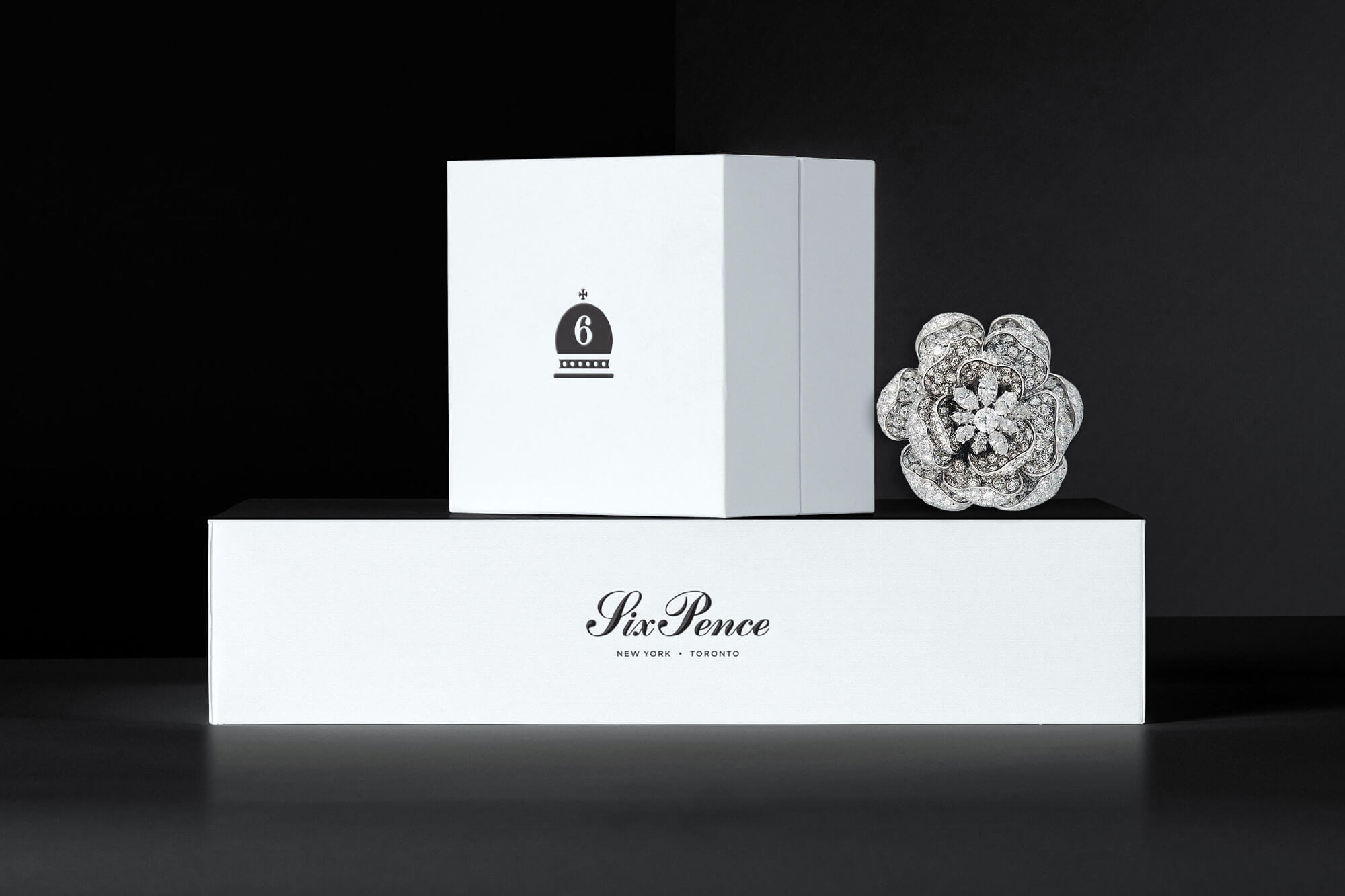
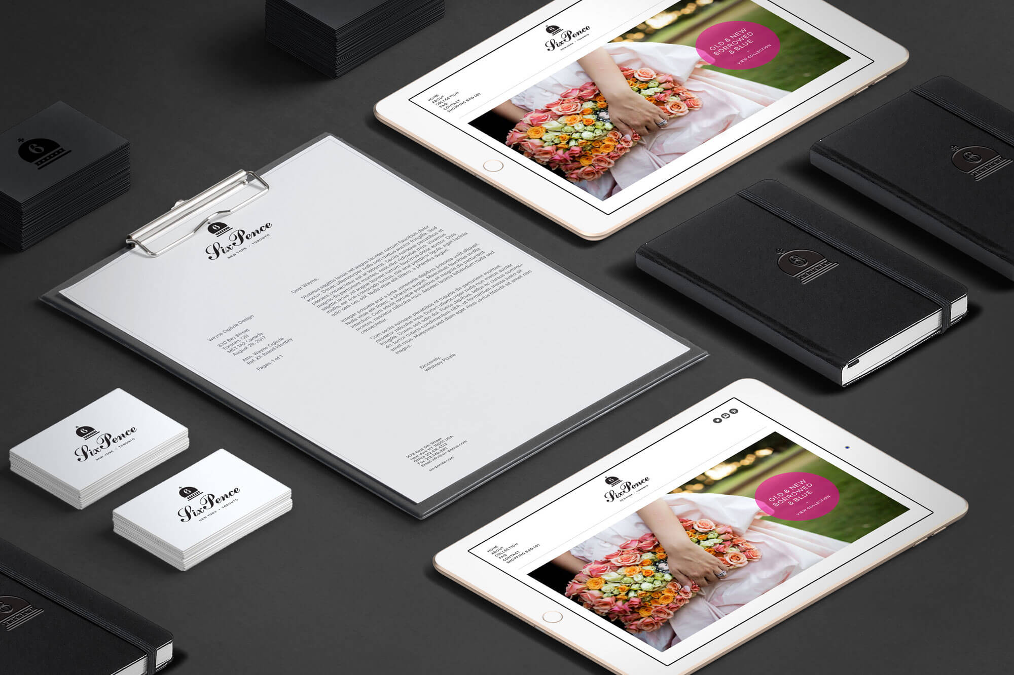
SixPence is a bridal and wedding accessories company inspired by the saying “Something old, something new, something borrowed, something blue… and a SixPence for her shoe.” This time old tradition is the inspiration behind SixPence’s modern take on bridal accessories. I worked with the company founder to create a brand identity that creates a happy union between modern minimalism and traditional elegance.
Logo & Visual Identity
Print Design
Packaging Design
Art Direction
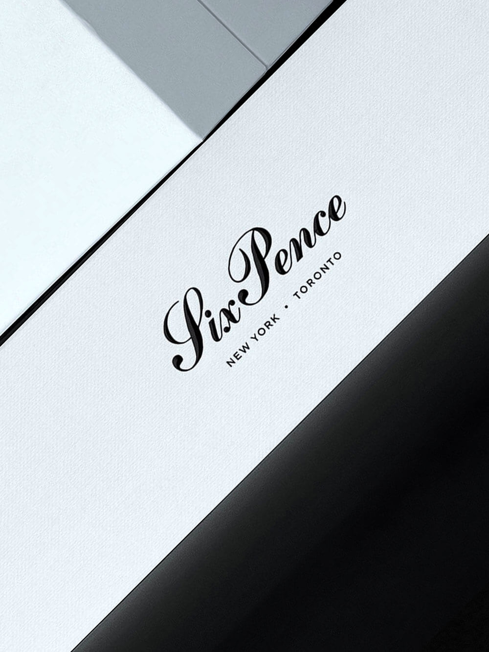
THE LOGO & VISUAL IDENTITY
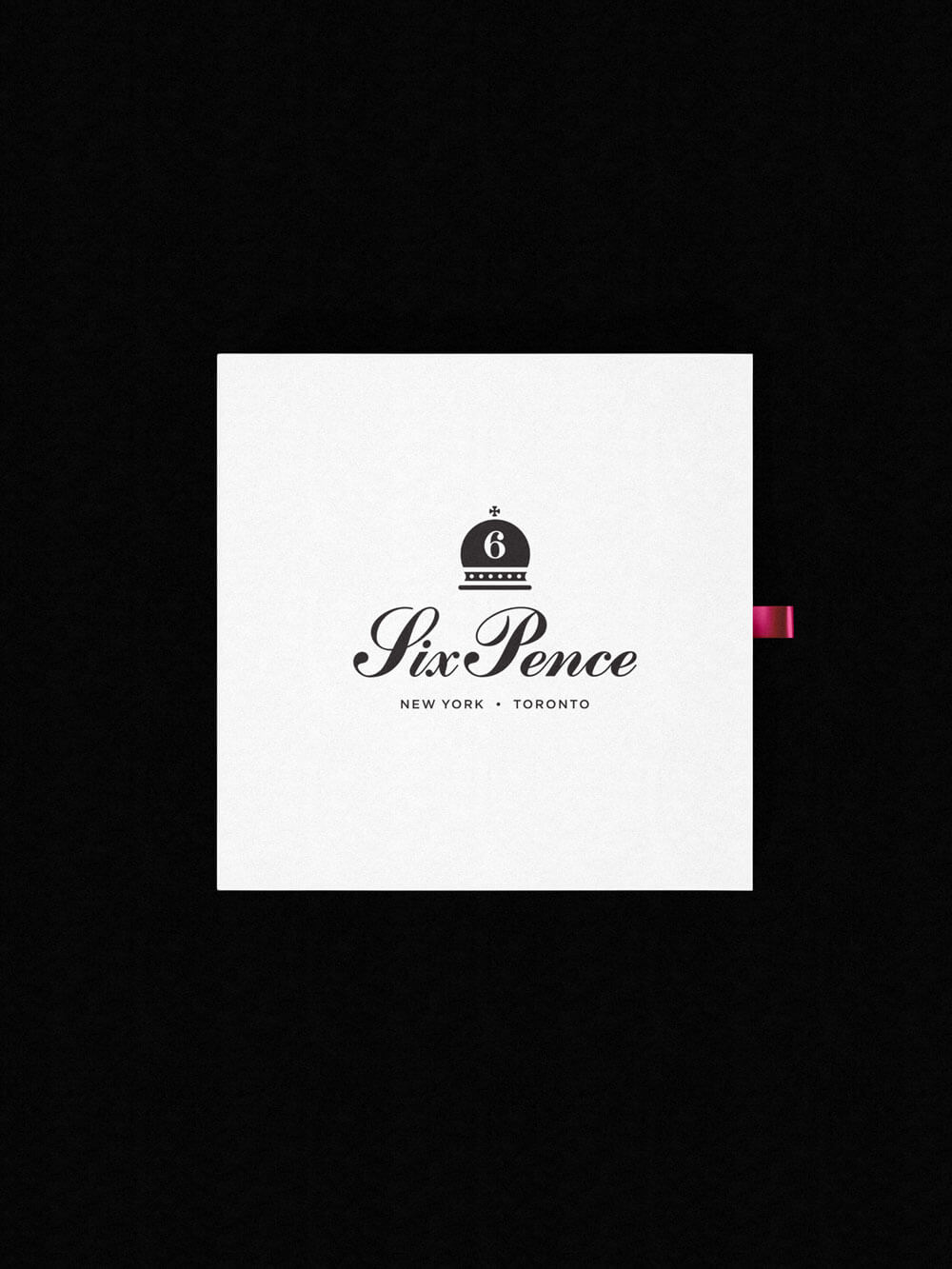
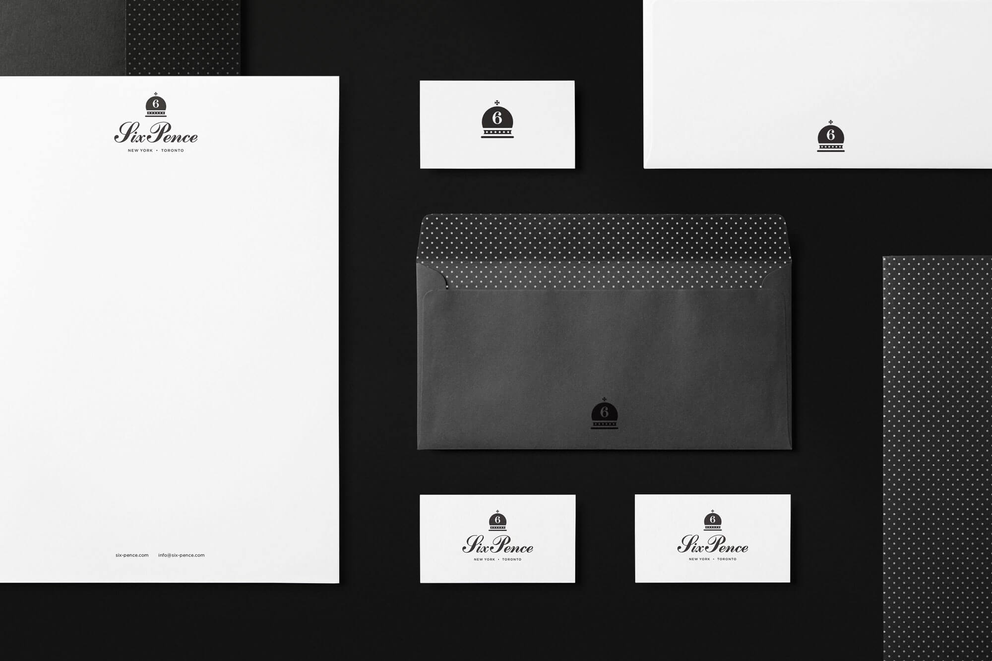
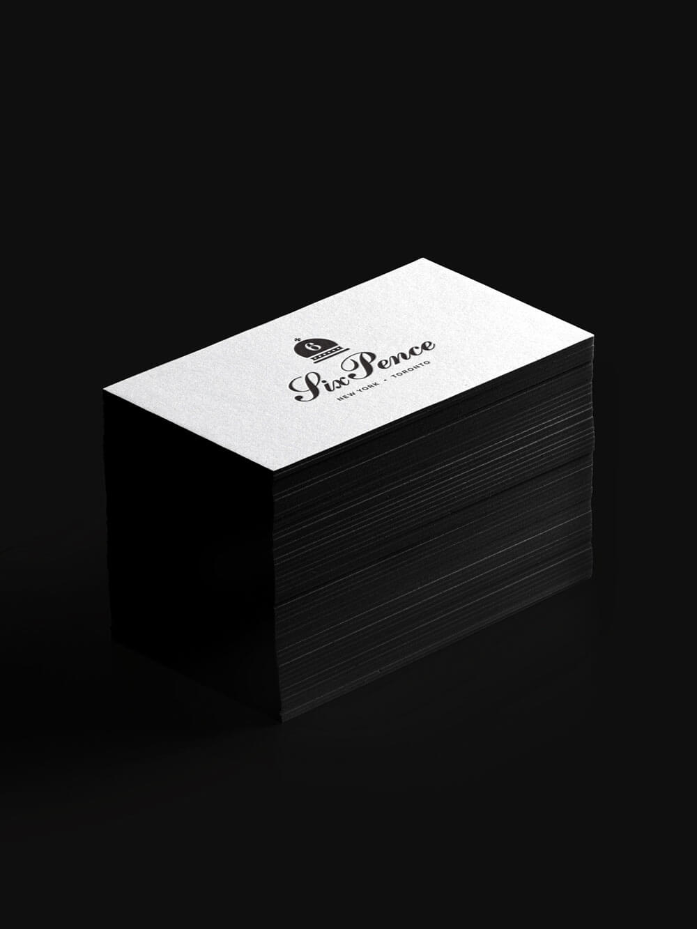
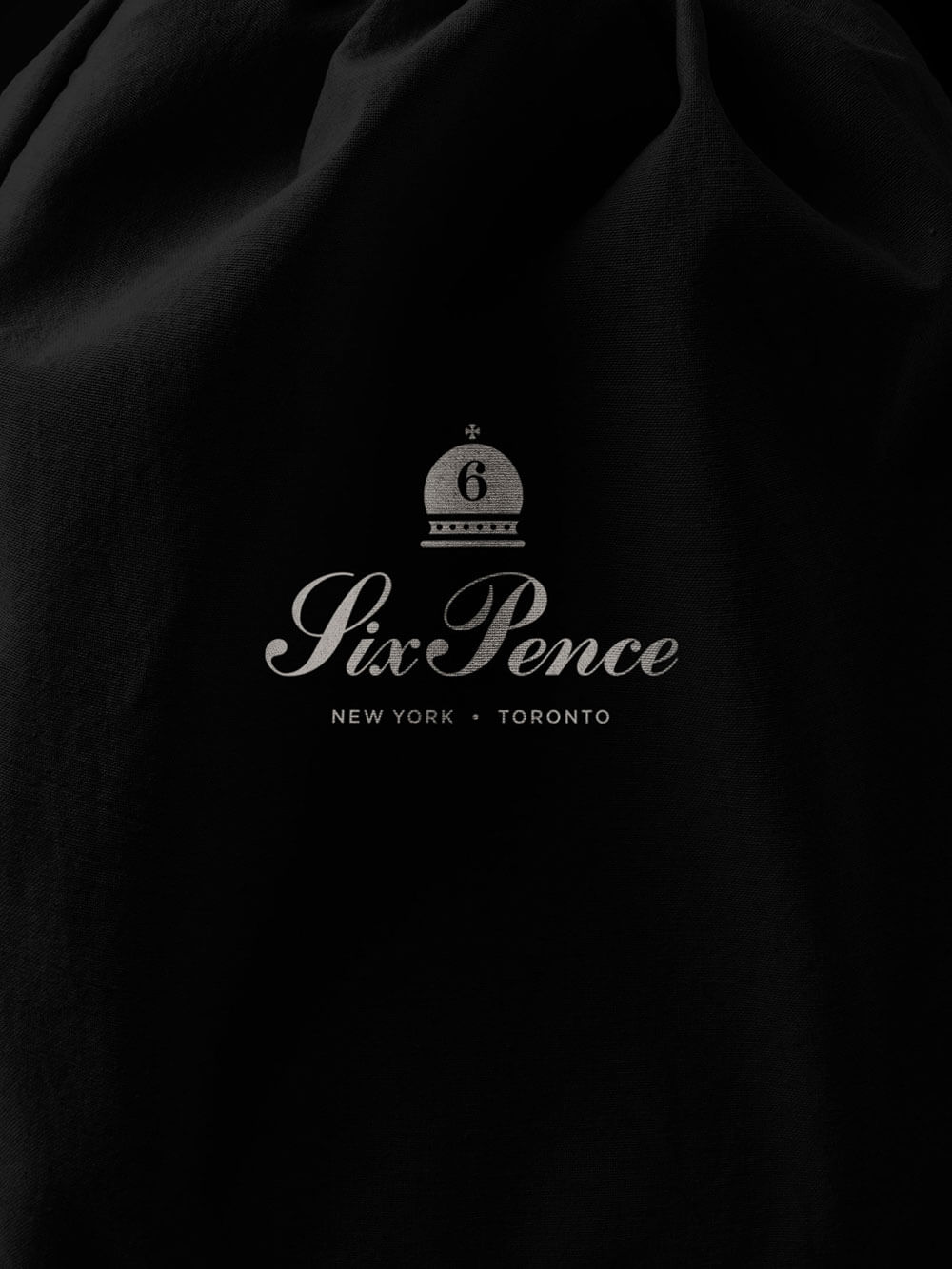
With the concept of ‘a modern take on traditional’ being central to SixPence’s philosophy as a business, I used this as a point of inspiration for the thinking behind the logo. The client wanted something that looked elegant yet accessible and appealing to their target audience of brides to be. We landed on a symbol with a shape reminiscent of a crown and a wedding bell. Added to this were decorative elements and ornamentation found on different variations of sixpence coins. The dot motif from the logo was carried through to the stationery and printed materials, providing a simple graphic element that is both playful and elegant.

ART DIRECTION
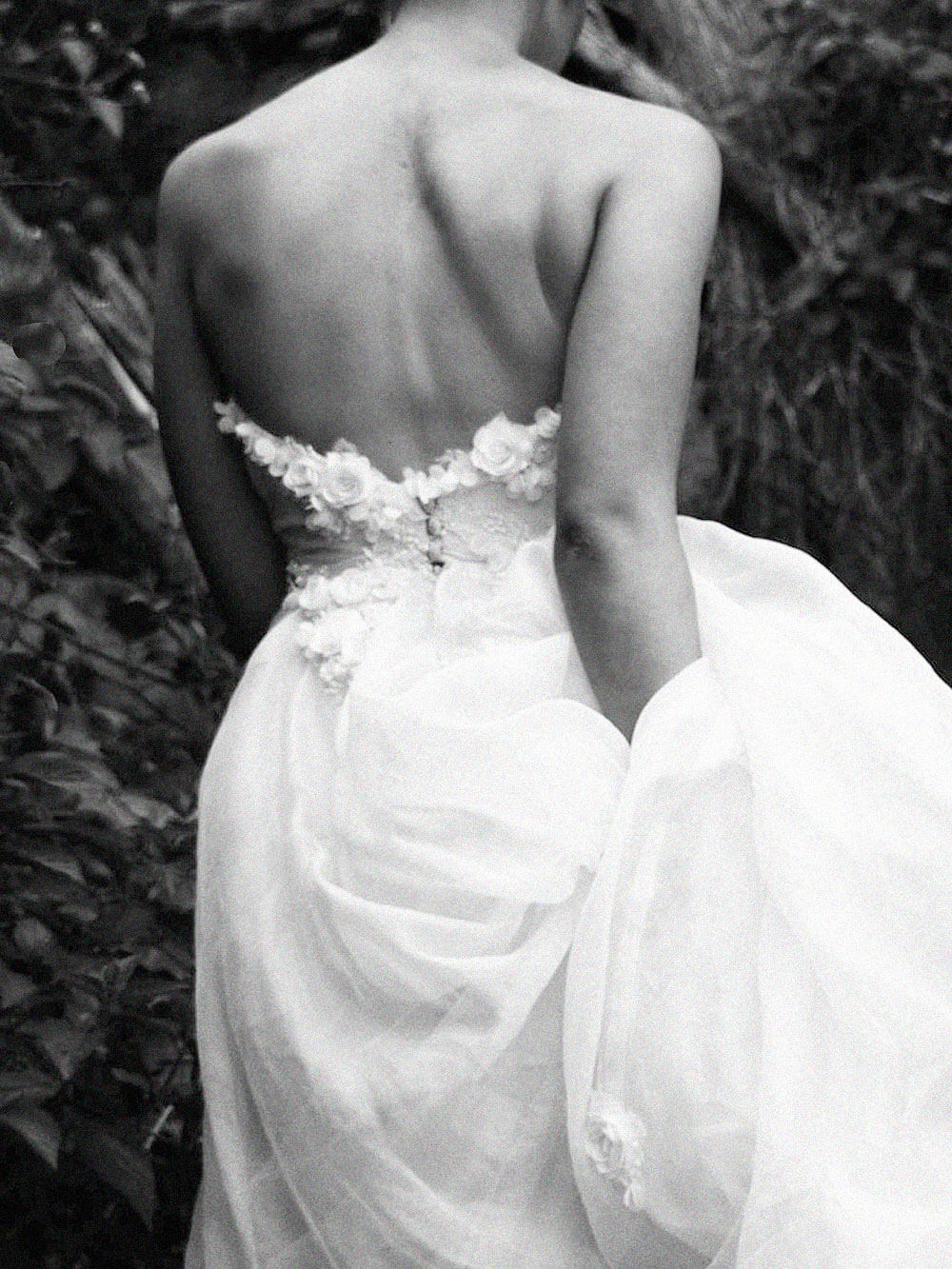
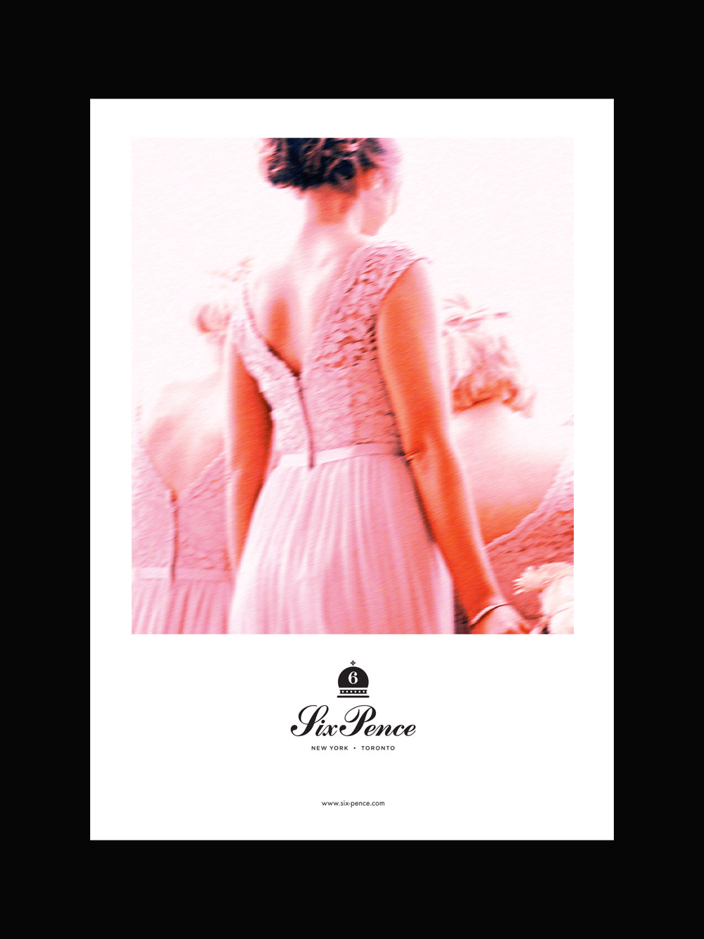
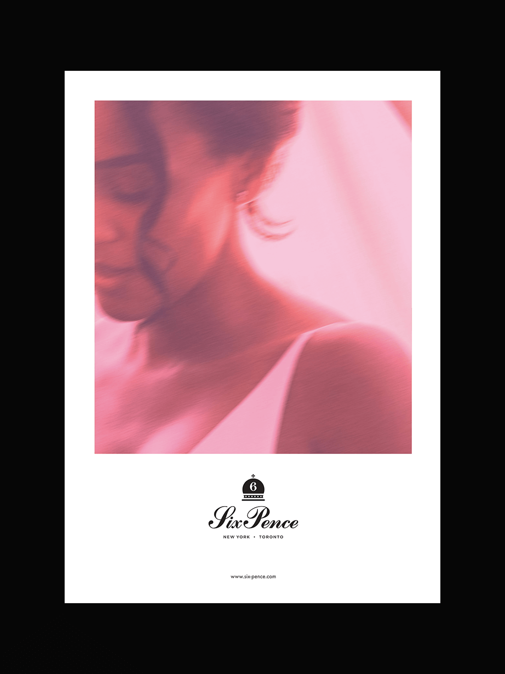
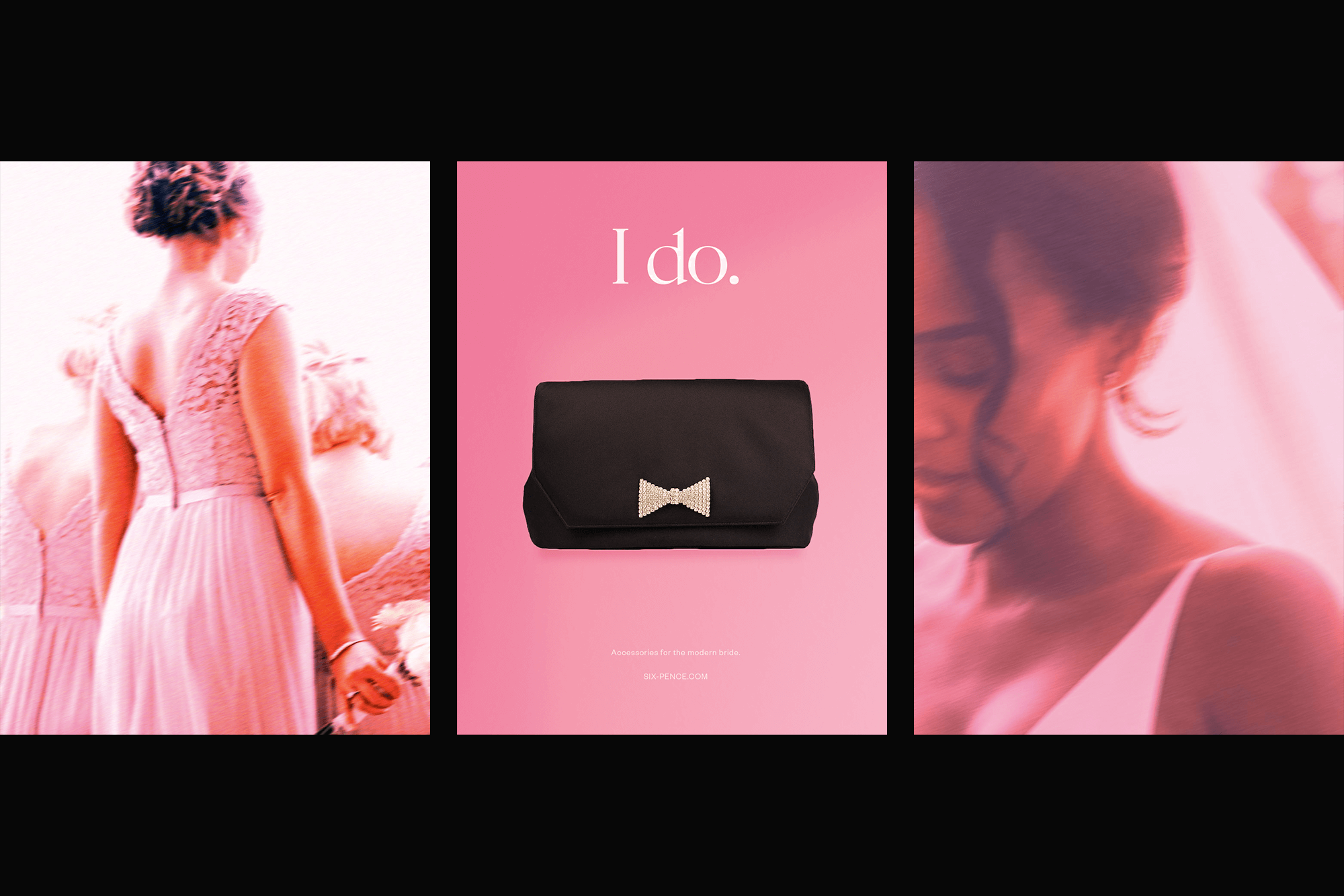
A series of supporting images were created for use in marketing materials around the concept of ‘memories and moments.’ Often times a brides' wedding day can feel like a dream and the memories can feel like impressions or snapshots of particular moments in time. To express this feeling visually, images were rendered in rose pink hues with an impressionistic, painterly effect applied to recreate that dream-like feeling that wedding days often have.
MORE PROJECTS
Creating a refined brand identity for a global creative production company in Los Angeles.
CONTACT
For new project inquiries and more information, please get in touch
Instagram
Linkedin
Twitter
ABOUT
Wayne Ogilvie is a brand identity designer, brand consultant and speaker based in Toronto, Canada. Wayne creates distinctive logos and visual identities for boutique businesses worldwide and has over 15 years of experience as a designer. Read more
UPDATES
For occasional news and updates about branding, life and culture please subscribe below
Subscribe
