Leader Lane Developments
Brand Identity
Leader Lane Developments is a forward thinking real estate development company with a focus on accessible luxury property development within desirable community settings. Established by two accomplished industry leaders, I worked with the company partners to identify and deliver on three key objectives – create a strong and identifiable brand identity, clarify the vision and product segment and legitimize the business in a competitive landscape.
Logo & Visual Identity
Print Design
Brand Guidelines
Art Direction
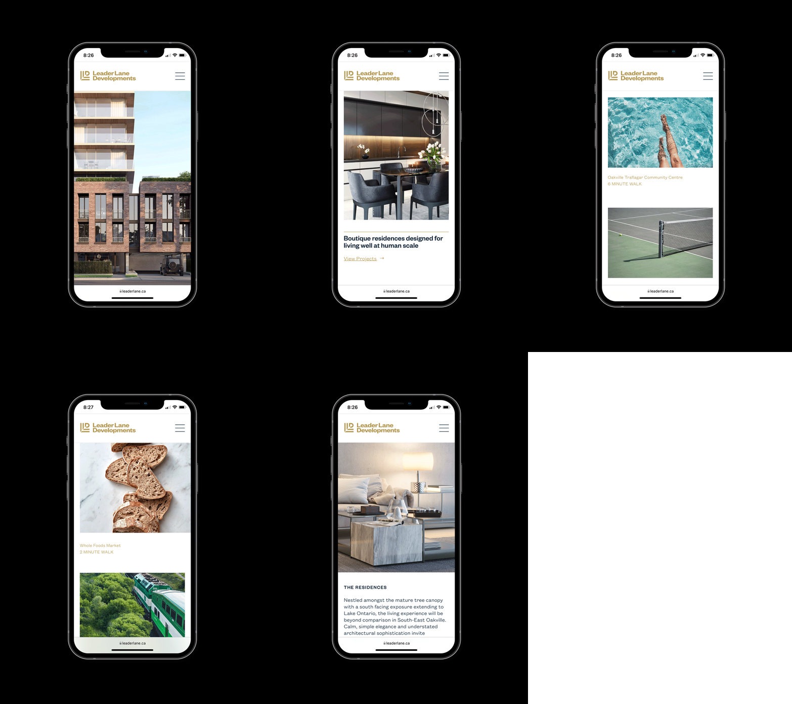
Website Design
THE SYMBOL
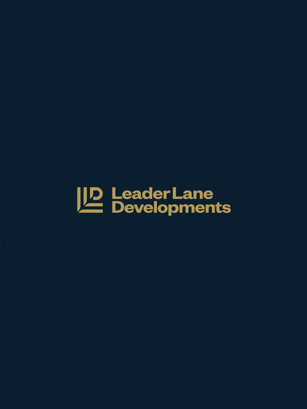
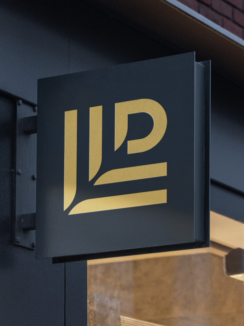
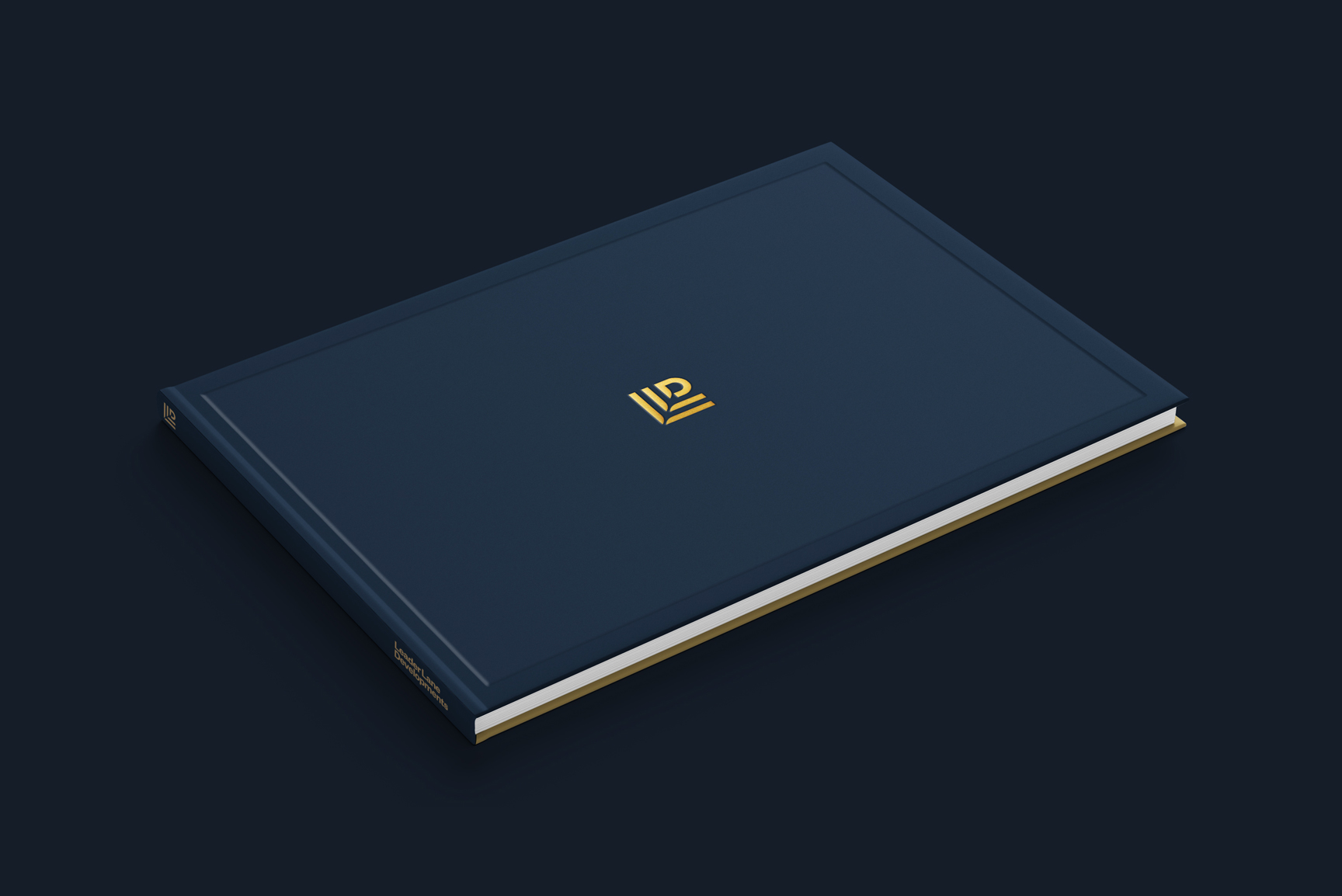
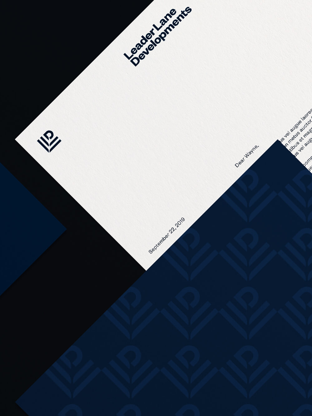
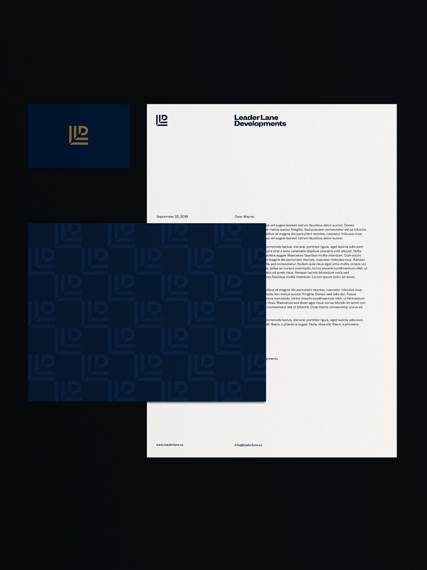
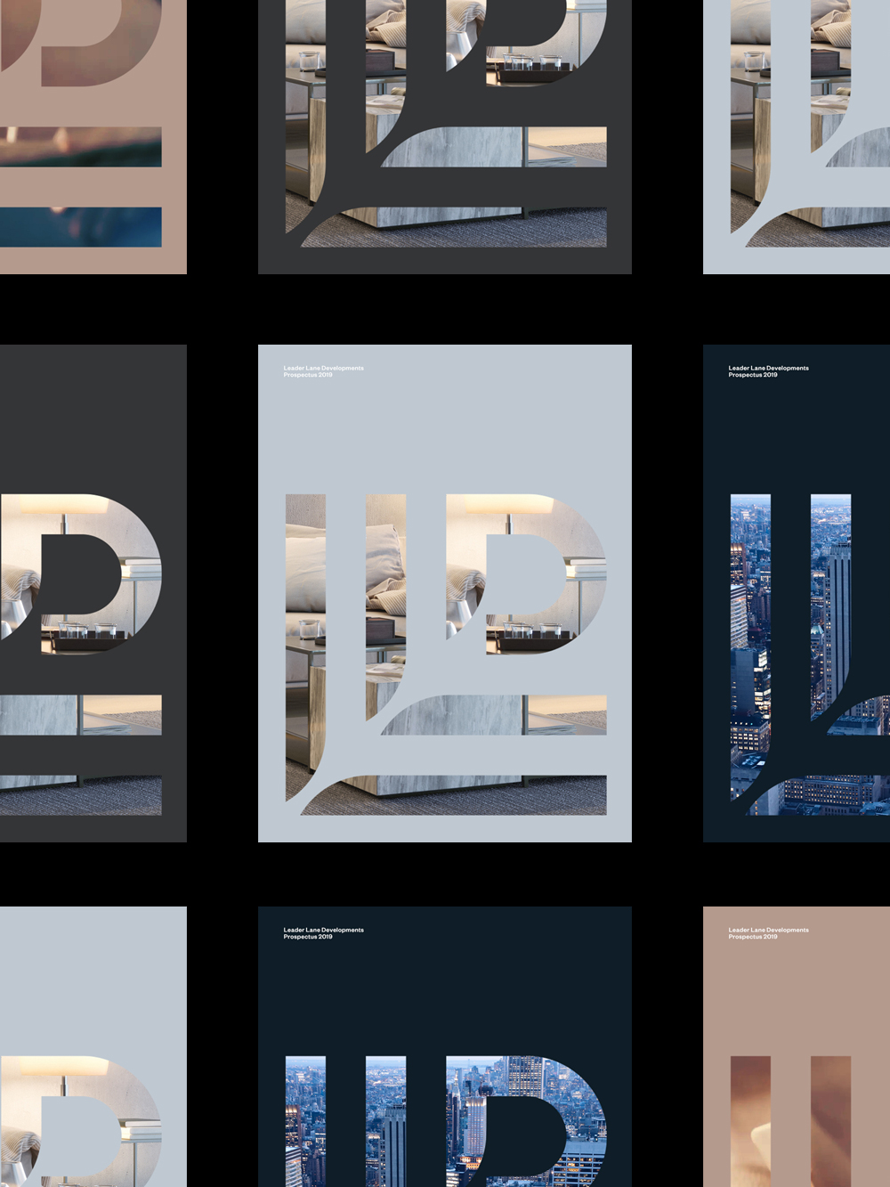
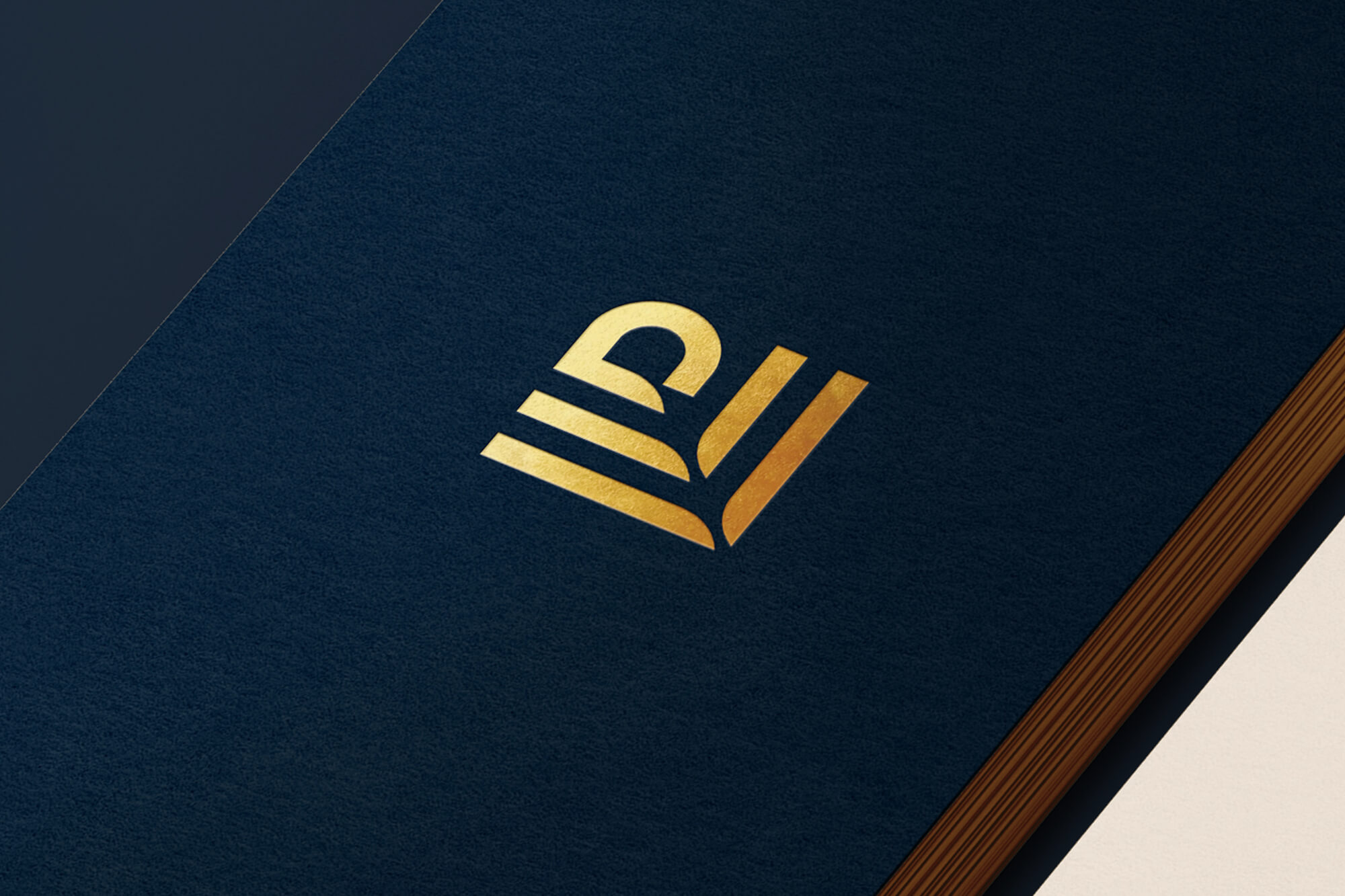
The concept of community builders is at the heart of the brand identity. The 'LLD' lettermark combines bold and curved forms, inspired by the unique shapes and patterns that urban buildings create when seen from an aerial view. The 45 degree angle 'pathway' that intersects each letter was also inspired by pathways that people create when they cut through a park or natural area within urban settings. The combined ideas work to form a recognizable and iconic symbol.

COLOR & MATERIALS
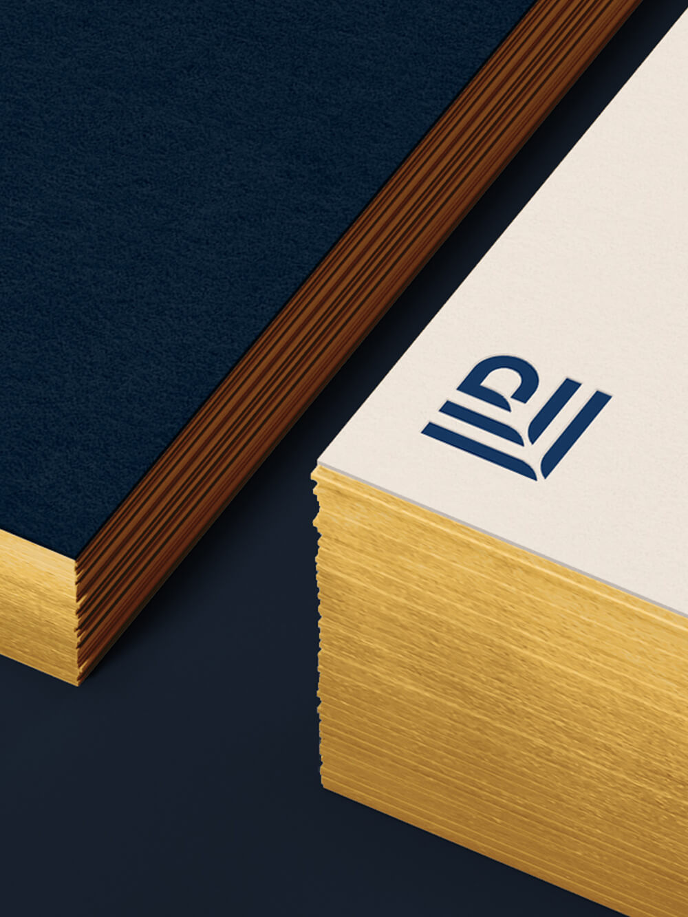
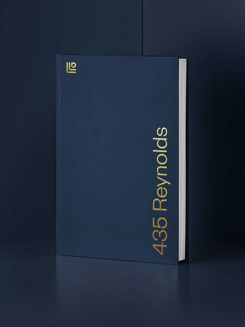
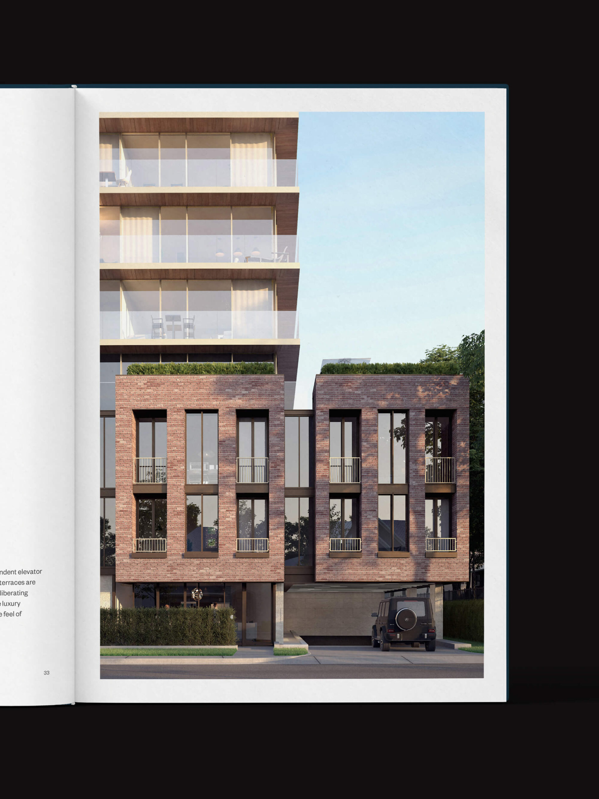
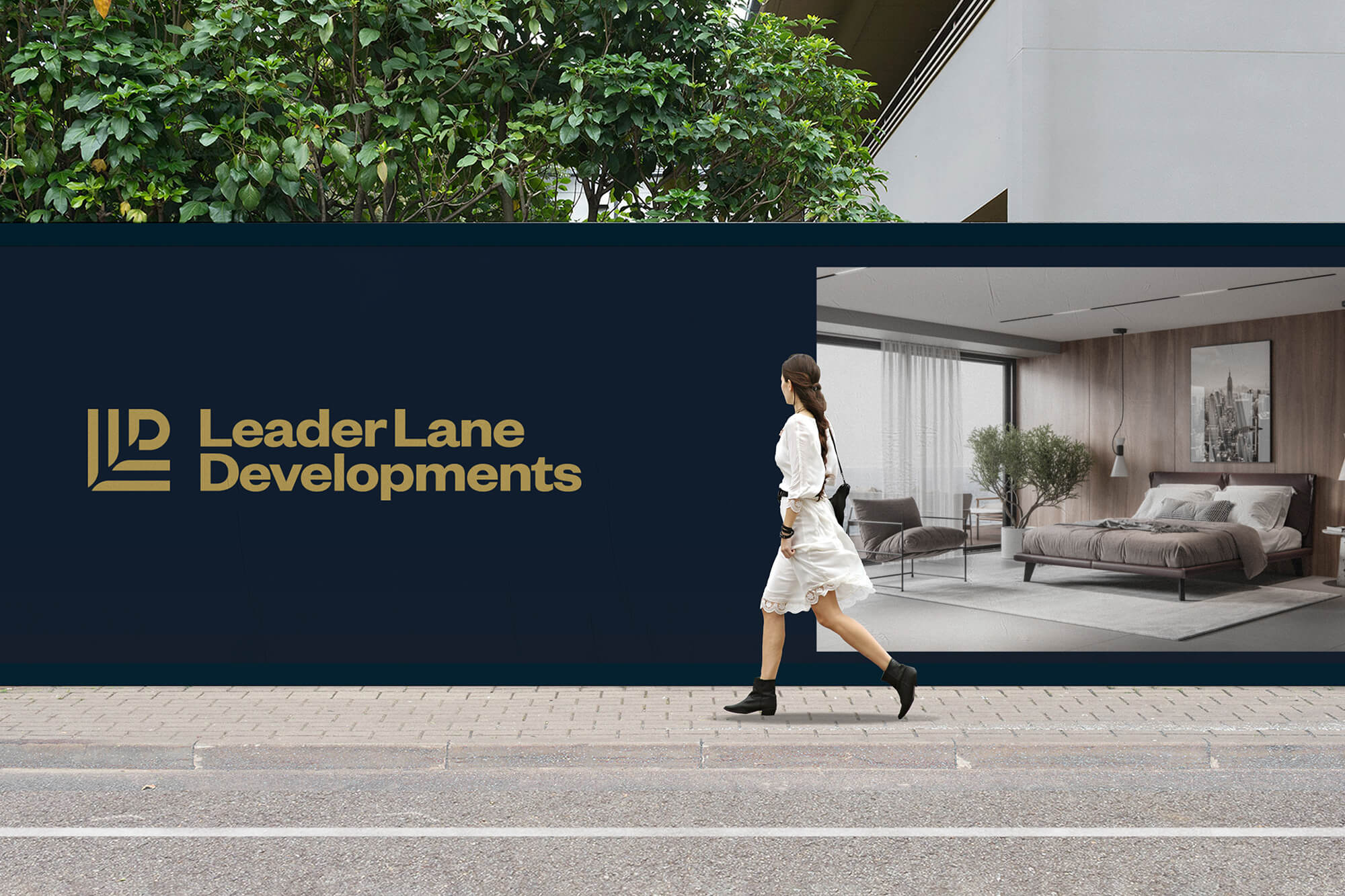
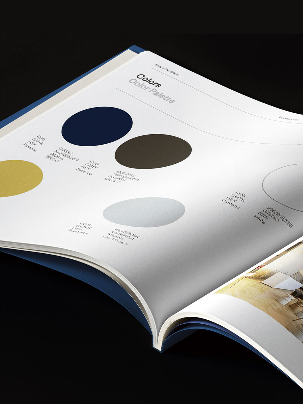
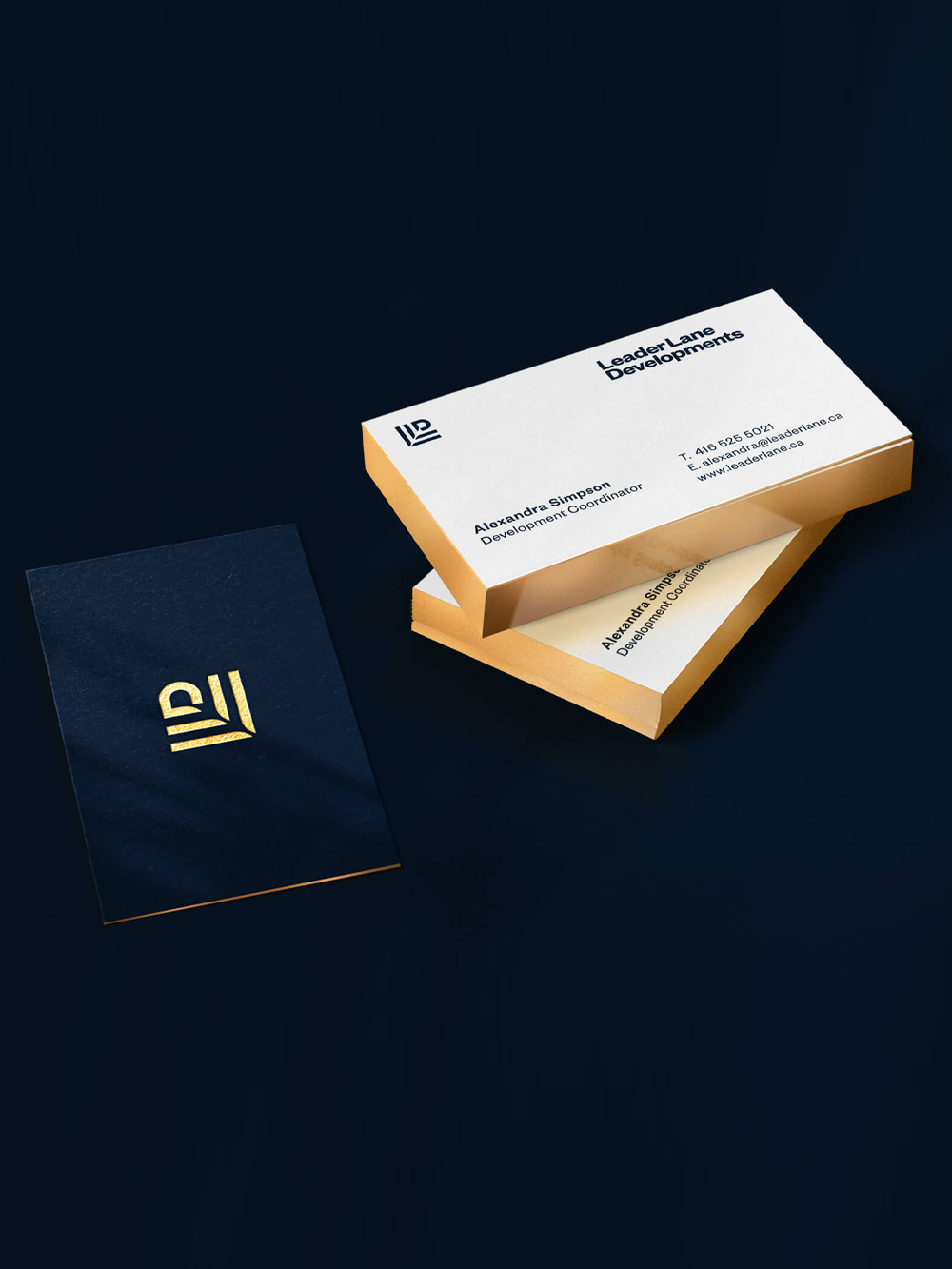
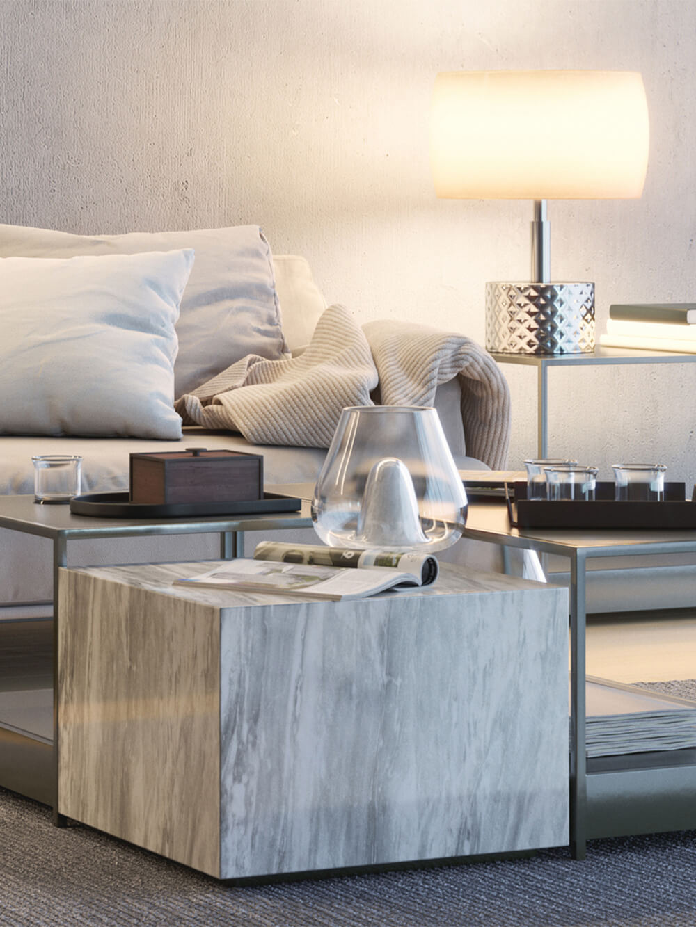
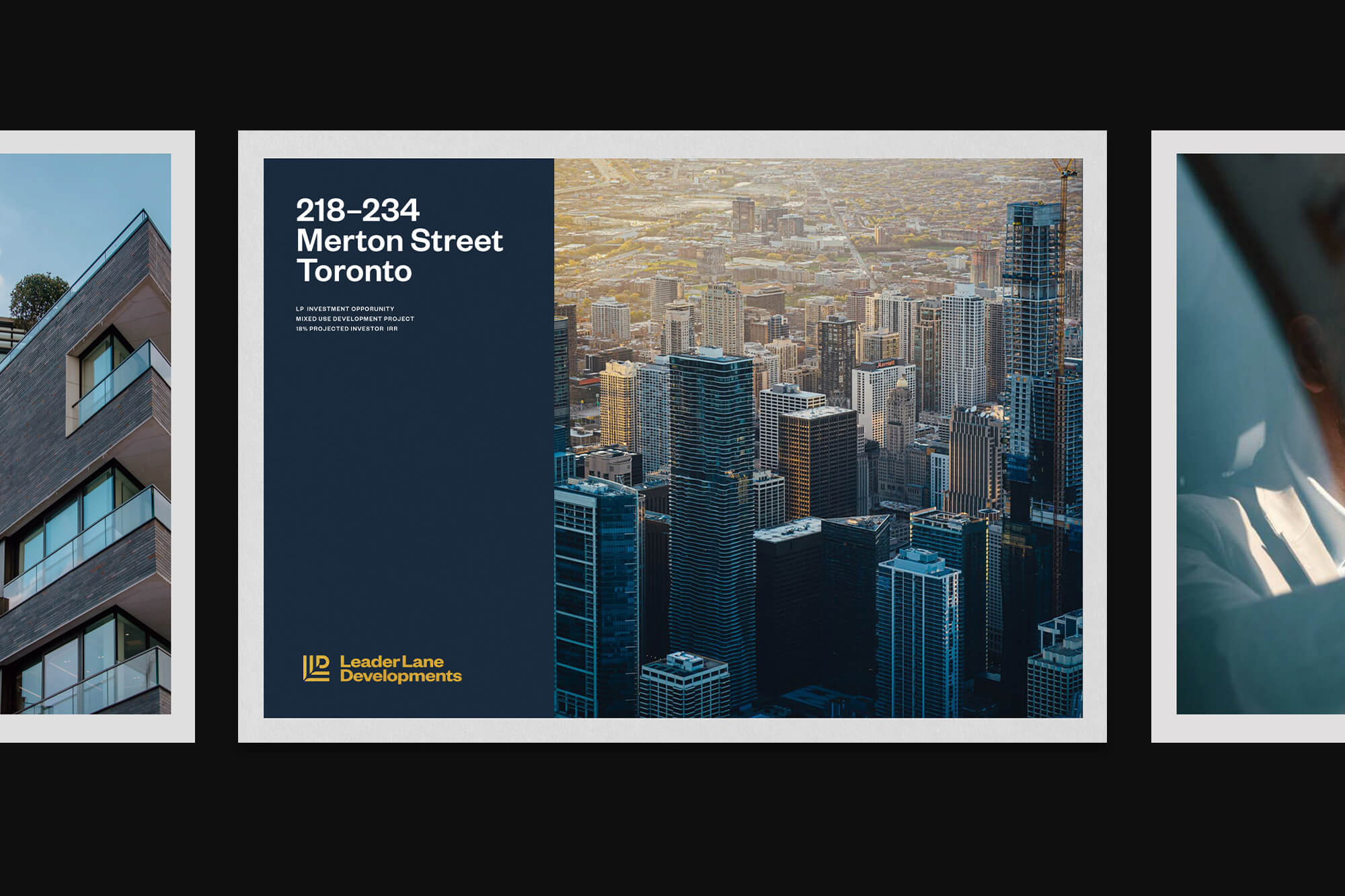
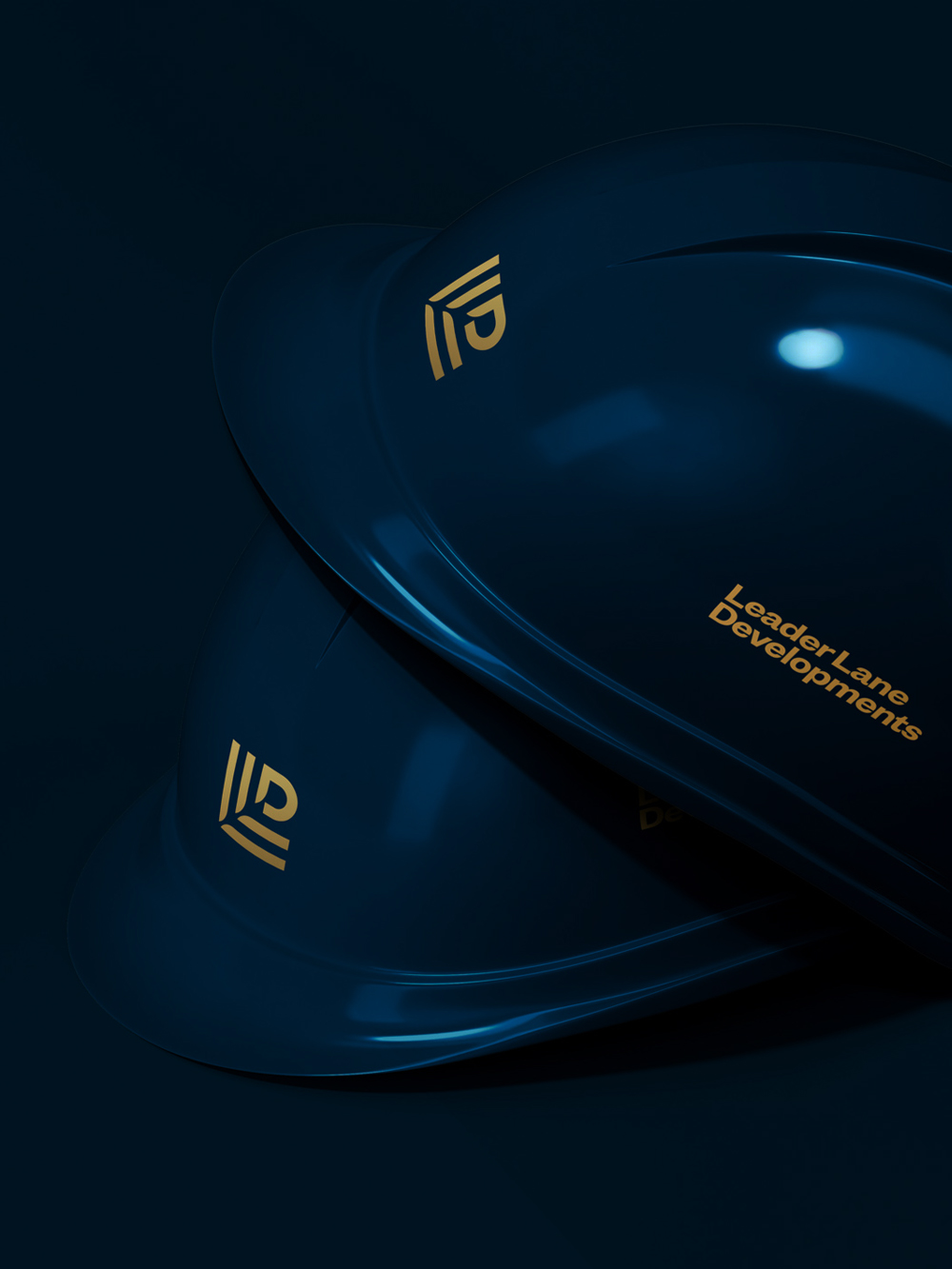
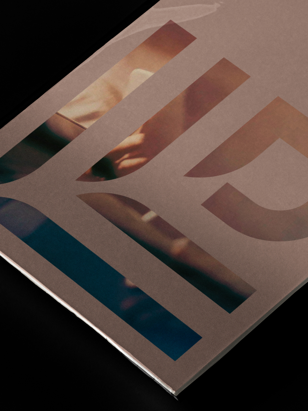
The visual identity was further supported by a palette consisting of deep Prussian blue with the logo cast in muted gold and applied to various branded collateral, further communicating the brand characteristics of quality, maturity and professionalism. Brand imagery was selected to highlight the attention to detail, desirable amenities and thoughtful finishing touches that characterize Leader Lane Developments' approach to creating livable and luxurious spaces for their clientele. All print and collateral material feature high-end finishes and premium touches such as foil stamping and guilded edges, further communicating the brand's upmarket positioning. Evocative brand imagery was curated for use across print and digital marketing materials.

MORE PROJECTS
A collection of brand identity and logo projects for clients across a range of sectors.
Creating a bold new look for an American womenswear brand in the fashion & resort markets.
CONTACT
For new project inquiries and more information, please get in touch
Instagram
Linkedin
Twitter
ABOUT
Wayne Ogilvie is a brand identity designer, brand consultant and speaker based in Toronto, Canada. Wayne creates distinctive logos and visual identities for boutique businesses worldwide and has over 15 years of experience as a designer. Read more
UPDATES
For occasional news and updates about branding, life and culture please subscribe below
Subscribe
